Next case
Cancercare
Redesigning the digital experience for cancer patients

hi, I’m Leonardo

I use design to solve business problems
I’m a multidisciplinary designer with a background in industrial and software
engineering. I
am
currently looking for full-time remote roles but open to freelance engagements.
With 7+ years developing web products and services. Built, redesigned and shipped +20
products
both as a solo developer and in the last couple of years as a Product Designer.
An avid youtube creator, 100+ videos and live podcasts talking about technology and
finances
for
the hispanic community.
Always willing to collaborate or carry out new inspiring projects. If you’d like to
discuss
a
potential idea or know about me and my work, don’t hesitate to contact me.
Work
About
hi, I’m Leonardo
I use design to solve business problems
I’m a multidisciplinary designer with a
background in industrial and software engineering. I am
currently looking for full-time remote roles but open to freelance engagements.
I’m more talkative on desktop and tablets. If you’d like to discuss a potential idea or know
about me and my work, don’t hesitate to contact me.
Affected by covid restrictions and lockdowns KahKow needed to connect with their customers where they were, the internet.

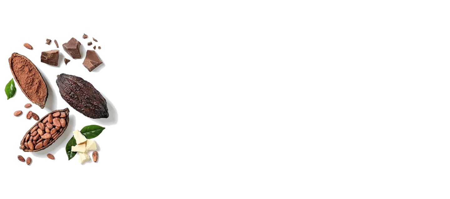
Kah Kow is a one-stop shop for chocolate makers and chocolate lovers.
It offers unique cacao bean profiles and cacao products such as liquor,
nibs, butter, and powder.
Most of the sales for the brand were direct sales made in their physical store in Brooklyn, New
York.
After covid, most stores were closed, creating the urgency for an e-commerce store where users could
consume
the brand.

Kah Kow serves two different demographics with the different
needs and purchasing behavior.
The store needs to make it easy for their clients to sort and
search the +500 products types. The two archetypes of the
client are the following:

The most profitable clients of the store are companies and individuals
that make confectionery from chocolate.
They purchase the raw materials in bulk and use the finished chocolate
products in the store to guide what they can accomplish.

Consumers with a sophisticated palate. They appreciate new and quality
chocolate products.
Some of them with special needs like Kosher and dairy-free chocolate.

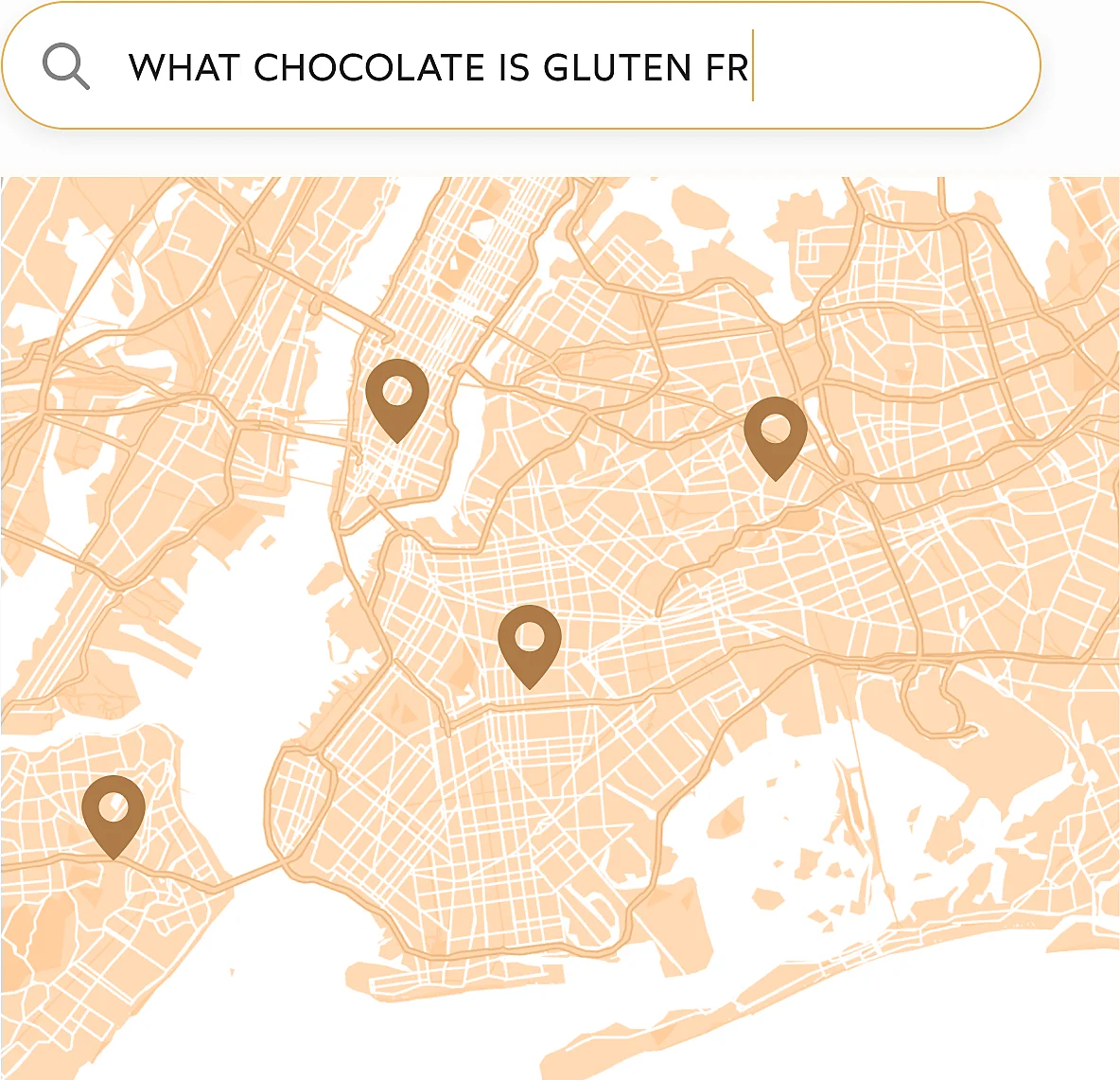
We started our research by identifying the consumers'
search criteria when googling chocolate products.
We first focused on the New York Sector.
The top searches showed us what was important
for the consumers and their needs.
We also discovered pet owners were really interested
in giving their pets chocolate!
Search is the most crucial section of the site, so we did a deep analysis of how we could categorize
the
products and how they related to the profiles of the users we had.
We discovered potential services or product categories that could expand the value for the customer.
Also, we identified elements that were missing from the current experience that were critical for
the
users.
Customer Centric
Product Centric
We created a descriptive menu showing the categories depending on the customer and their use case to improve search.


In order to improve search with the information about categories we created a descriptive menu detailing the main criterias categories useful for the customer and their use case.


We decided to choose a pretty minimal palette to make the product photography the protagonist of
every
page.
The limited colours provide a more premium look to the brand. A risky move that paid off in the end.

Our research also showed business opportunities related to their niche that were not being used.

Flowers
Chocolate is a recurring gift for special days and anniversaries.
Our investigation showed a high correlation between purchasing those two items.

Special Ocassions
The consumption of chocolate is affected by seasonality. Important dates like Christmas, Easter,
Mother’s day and anniversaries influence it.
Creating gifts, limited editions and bundles for these special occasions can improve the dollar
amount per client.

Giftcards
Our research discovered that end consumers do not always know what to buy for others (one of the
main reasons for purchases).
The gift cards became a convenient way of addressing that issue.

Corporate Gifts
Company gifts are a marked not explored for the company.
The technical capacities and our benchmarks against the competition showed us a profitable
market
with enormous opportunities for growth with more people working from home.


The new design improved the sales on the site by 34%, and the average order size increased by 23%
from
their pre-pandemic sales.
The online shop also opened a digital channel for leads of the products for Chocolatiers and
chocolate
product companies.